The Origins of Morandi Colours: From Still Life to Wardrobe
One Painter, One Colour Philosophy
The name "Morandi colours" comes from the Italian painter Giorgio Morandi (1890–1964). Across his life he painted countless still lifes of bottles and jars, in which the colours are almost always softly wrapped in grey — low in saturation, low in contrast, never in sharp conflict with one another. It is precisely this restrained, harmonious palette that fashion and design later borrowed as the name for a whole colour language.
Traits of Morandi Colours
- Low saturation: every colour is mixed with a degree of grey, muting both brightness and purity.
- Low contrast: transitions between colours are soft, with few jarring clashes.
- High harmony: because their greyness is so close, any combination looks unified.
The temperament of these colours is quiet, reserved, and easy to live with — very much in tune with the understated aesthetic of recent years.
Why They Wear So Well
Highly saturated colours grab attention at first glance but tire the eye quickly; Morandi colours are the opposite — they are in no hurry to speak, yet they hold up over long acquaintance. This "slow-burn" quality makes them especially suited to transitional seasons like winter-into-spring, which call for a calm base note.
Common Morandi Colours
- Greyed pink: soft without being saccharine.
- Hazy blue: blue with grey added, calm and gentle.
- Sage green: a low-saturation grey-green, natural and refined.
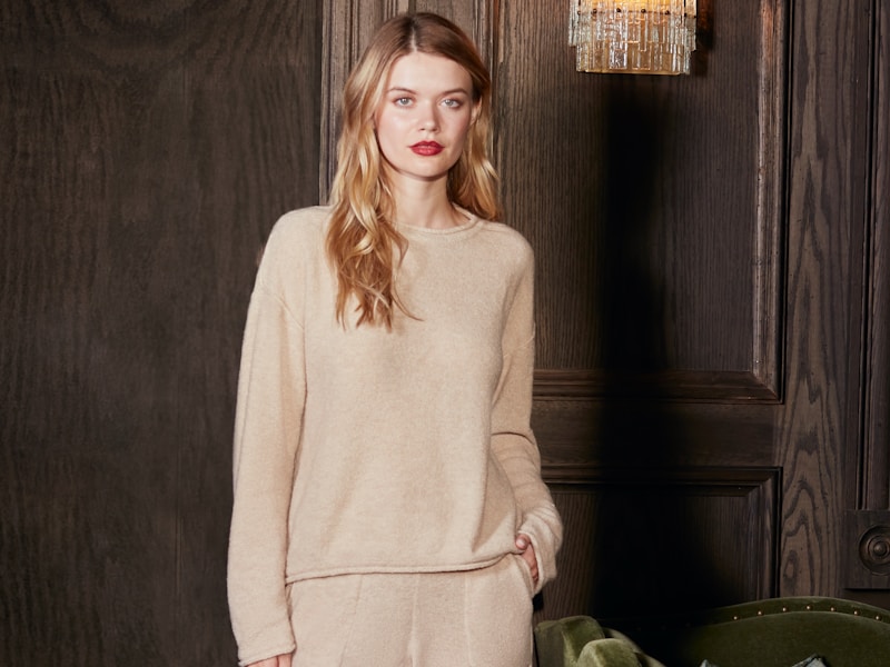
- Oatmeal: a warm greyed beige, an all-purpose base.
- Smoky mauve: a reserved grey-purple with a touch of melancholy.
"The best colours are often the ones that don't shout." —— Guushu Colour Team
One Reminder
The elegance of Morandi colours rests on unified greyness. When combining them, keep the greyness of the different colours close, and avoid slipping in a single over-saturated colour that breaks the calm — that is often why a look ends up feeling "muddy" or "busy."